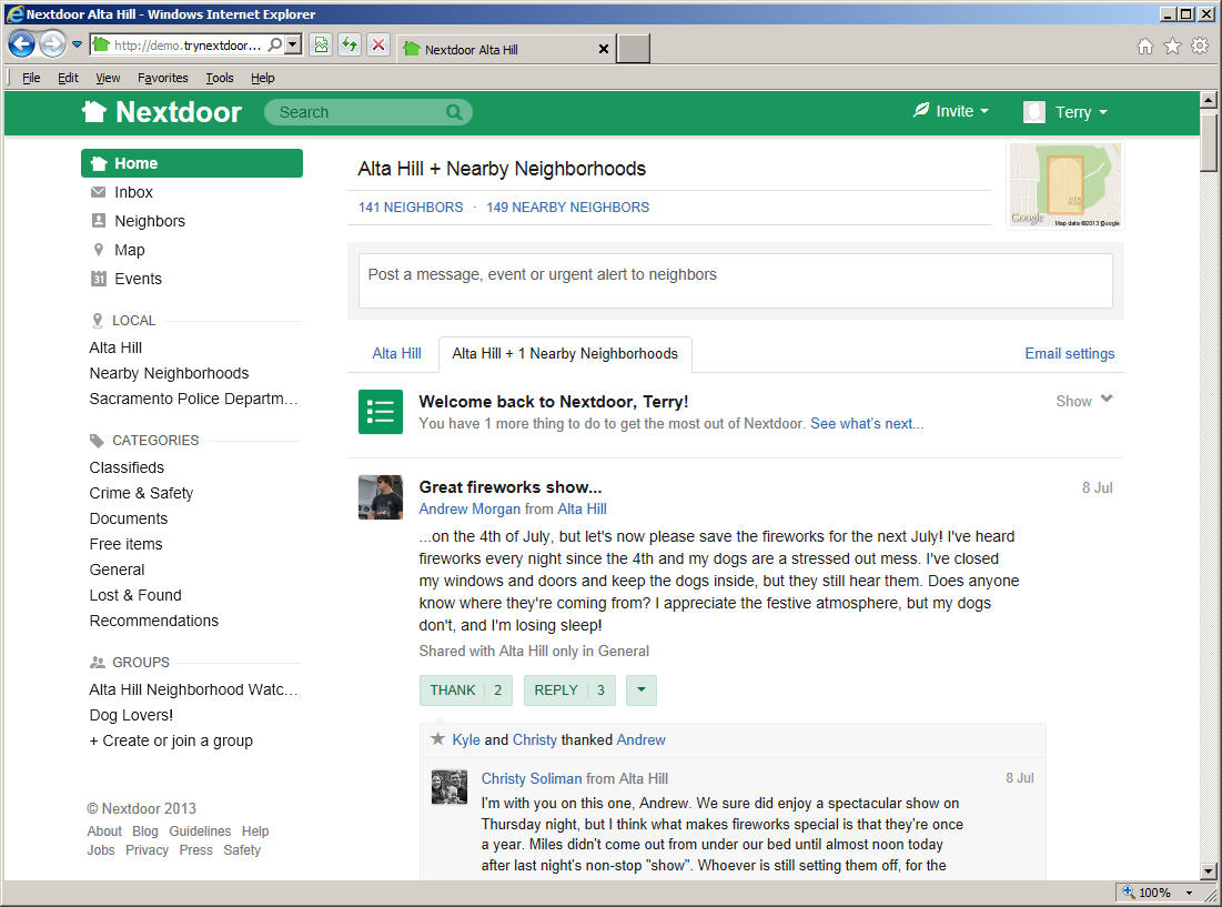
After you sign in to Nextdoor, the home page will come into view:
Note
Nextdoor uses a website design method known as “responsive design.” Websites that use responsive design adjust automatically to different devices, web browsers, and web browser window sizes.
The pictures of the “Nextdoor Alta Hill” website in this manual were made with a full-size web browser window on Microsoft Windows. If you use the Nextdoor website in a small web browser window, or on a smartphone or tablet computer, the website will look different. On devices with very small screens (such as smartphones), some functions will not be available.
You will see a ≡ symbol at the top left corner of a small web browser window. (If you see the ≡ symbol, the window is too small to show the list of links at the left side of the window. On some devices, if you turn the device to the right or left, possibly you will see the list of links.) Click or tap the ≡ symbol to see the links that are usually at the left side of the window.
Nextdoor's performance on a smartphone will possibly be better with a mobile app than with a mobile web browser. For more information on Nextdoor for iPhone, see Chapter 16, Nextdoor for iPhone. For more information on Nextdoor for Android, see Chapter 17, Nextdoor for Android.
From the home page, you can:
use the Search box to find messages that contain specified words. For help with the Search box, see Chapter 8, How to Read and Send Messages, Section 8.4, “How to Search for Messages”.
use the menus at the top right corner of the page:
Invite: Click this menu to invite your neighbors to join Nextdoor. For help with invitations, see Chapter 13, How to Invite Your Neighbors to Join Nextdoor.
Click your name at the top right corner of the page to change your Nextdoor settings. For help with your Nextdoor settings, see Chapter 7, How to Change Your Nextdoor Settings.
post new public messages. For help with public messages, see Chapter 8, How to Read and Send Messages, Section 8.1, “Public Messages”.
read messages that neighbors posted. For help with this, see Chapter 8, How to Read and Send Messages, Section 8.1, “Public Messages”.
thank neighbors for their messages, or reply to messages. For help with this, see Chapter 8, How to Read and Send Messages, Section 8.1.1, “How to Thank and Reply”.
move messages to different categories to help neighbors find information more easily. For help with this, see Chapter 8, How to Read and Send Messages, Section 8.1.2, “How to Change a Message's Category”.
“flag” messages that contain bad language, advertising, or other inappropriate information. For help with this, see Chapter 8, How to Read and Send Messages, Section 8.1.3, “How to Flag Messages”.
welcome new members to Nextdoor. For help with the button, see Chapter 13, How to Invite Your Neighbors to Join Nextdoor, Section 13.5, “How to Welcome New Members”.
use links at the left side of the page to see different areas of the website:
Home: Click this link to go to the Nextdoor home page.
Inbox: Click this link to see private messages that you sent to other neighbors, or that other neighbors sent to you. For help with your inbox, see Chapter 8, How to Read and Send Messages, Section 8.3, “Private Messages”.
Neighbors: Click this link to see a list of Nextdoor members in your neighborhood. For help with the neighbors list, see Chapter 10, How to Find a Neighbor on Nextdoor.
Map: Click this link to see a map of your neighborhood. For help with the neighborhood map, see Chapter 11, How to Use the Neighborhood Map.
Events: Click this link to see a calendar of future and past events. For help with events, see Chapter 12, How to Use Events.
A “LOCAL” section that includes:
your neighborhood's name: Click this link to see only messages from your neighborhood.Nearby Neighborhoods: Click this link to see messages from your neighborhood, and also residents of Nearby Neigborhoods. For help with Nearby Neighborhoods, see Chapter 6, Nearby Neighborhoods.
If your city is a member of the Nextdoor City Program, a link to information from your city officials, police department, and/or fire department. For more information on the Nextdoor City Program, go to http://help.nextdoor.com/customer/portal/articles/1148541-what-is-the-nextdoor-city-program-?b_id=98.
A “CATEGORIES” section that includes:
Classifieds: Click this link to see messages about items that neighbors want to sell or buy.
Crime & Safety: Click this link to see messages about crime and safety.
Documents: Click this link to see a list of files that neighbors share with other neighbors.
Files can be in different formats, for example:
Picture or photo files can have names that end with
.GIF,.JPG,.JPEG, or.PNG.Portable Document Format files have names that end with
.PDF. You can open PDF files with software such as Adobe Reader.Microsoft Word format files have names that end with
.DOCor.DOCX. You can open these files with Microsoft Word.Microsoft Excel format files have names that end with
.XLSor.XLSX. You can open these files with Microsoft Excel.
To open files in the Documents section, you must have the necessary software installed on your computer. For example, to open a PDF file, you must have Adobe Reader (or some other software that can open PDF files) installed on your computer. To open a Microsoft Word document, you must have Microsoft Word (or some other software that can open Word files) installed on your computer.
Free items: Click this link to see messages about items that neighbors want to give away for free.
General: Click this link to see messages that do not fit into some other category.
Lost & Found: Click this link to see messages about lost or found pets or items.
Recommendations: Click this link to see messages about companies or services neighbors used, and if the neighbors recommend those companies or services.
For help with public messages, see Section 8.1, “Public Messages”.
A “YOUR GROUPS” section that shows links to the public and private groups of which you are a member, and a Browse all
#groups link. For help with groups, see Chapter 9, Groups.A group of links to Nextdoor web pages, including:
About: Click this link to see information about Nextdoor.
Guidelines: Click this link to see the guidelines to use Nextdoor.
Help: Click this link to go to Nextdoor's “help” page. For help with Nextdoor's “help” page, see Chapter 15, How to Get Help.
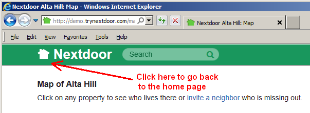
The list of links you see at the left side of the home page will also be on most other Nextdoor pages. Some pages do not have the links at the left side of the page. (For example, the “Map” page does not have the links at the left side of the page.) To go back to the home page, click the picture of a house or the word Nextdoor at the top left corner of the page: